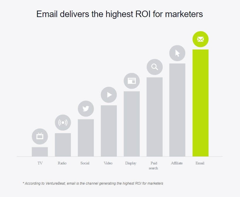
Email marketing is not only still around, but if you look at the statistics, it gets the best rate of investment (ROI) over other media channels.

I started this list with only 6 items, but as I continued writing more and more would pop into my head. When I first began email marketing, I made most of these mistakes. That’s why I wanted to create this list so you don’t make the same mistakes. I also wanted to keep this list short so not every mistake or all the fine details will be covered. However, I found These issues to be the most critical.
1. Not having a goal or clear message.
Make sure you know what you are trying to achieve. Do you want someone to buy a specific product, get higher click rates, or get more hits to your website to increase your search engine rank. Whatever the goal, make sure your campaign is specific to that goal and not just a general email with no focus.
2. Not having a target audience.
Your business may sell different items. Some of these items may not appeal to your entire audience. Do not send emails to someone who does not fit the profile for that product. Most likely, they will mark your email as spam and unsubscribe.
3. Lack of personalization.
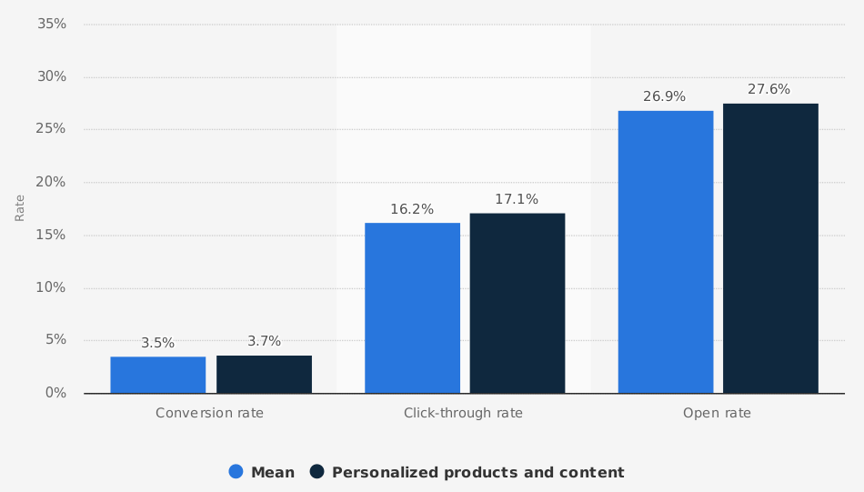
Not all emails need to be personalized but there are studies showing that incorporating user names get higher open rates. Sometimes these studies seem a little fishy to me, especially when they come from parties that have invested interests. But, readers seeing their name in an email could spark an added interest, especially if it is something they need*.

4. Not Having a Clear Call to Action (CTA).
A call to action is text asking your reader to do something. Like, buy my product on amazon and here is the link. Making a call to action easy increases your chances of getting clicks. Let’s face it, time is valuable and anything unclear can make your reader quickly leave. So making it quick and easy is always a plus.
5. Not having the correct landing page linked to your CTA.
I see this all the time. It will frustrate your readers to the point of unsubscribing. Clicking on a button that is promoting, say 25% off, then ending up on a home page will not only make your readers confused, but they will stop reading your emails. They will check it off in their minds that this website is too confusing and will say to themselves, I don’t have enough time to figure this out.
6. Not looking Professional.
This is another thing, I see a lot of. Ugly emails that look like someone who just fell off the turnip truck. You have to look your best when marketing. Readers are skeptical of new products, especially in emails, where there are already so many scams. People are apprehensive and unsure if they want to take a chance on someone with an unknown reputation. Using a professional graphic designer will greatly enhance your look.
7. Not Mobile Friendly.
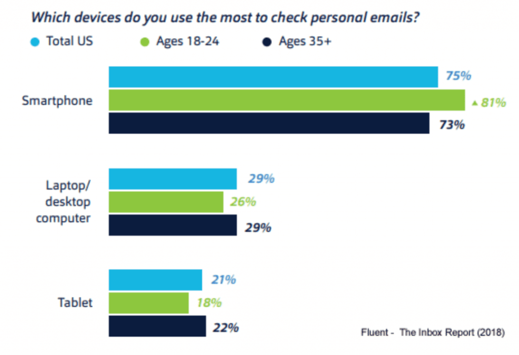
Your design may look great on a laptop, but when you look at it on a phone it becomes another story. The text and images may be too small to read, or your layout may go out of the frame. Zooming in and out, and scrolling in different directions, creates unnecessary confusion. Over 70% of readers are now on mobile devices. This is more than half of your audience. Do you want to take a chance on loosing that many subscribers?

8. Not setting up your email client correctly.
You could have the best email designs with perfect CTA’s and landing pages. But, if emails a going to your readers spam folders, no one will see it. Do Research on email marketing applications. Some are much better than others. Make sure you can set up DKIM and SPF. These protocols help emails stay away from spam folders. Talk with your email marketing provider to set it up.
9. Not thinking about your IP address and ‘From Address’.
This is tricky, confusing and hard to find the truth, especially if you are buying email lists. The ‘from address’ is the address you are using to send out the emails. Many companies will use the ‘from address’ as an organizational tool. Like, newsletter@mydomain.com or deals@mydomain.com. The bigger issue here is the dedicated IP address. There are two schools of thought. Some say to use another IP address when sending out emails. The reason for this, is if you have too many emails that get marked as spam your IP address will be blacklisted. However, if you are using a shared IP address, which many of us are, then it doesn’t matter, since anyone in your shared group can ruin your IP’s reputation. This may be one reason to get a dedicated IP address. The bottom line, talk to your service provider to get informative IP and ‘From Address’ answers.
10. Sending too many emails.
I remember signing up for an email. and getting something everyday and sometimes twice a day. Even though I liked the product and might have been a customer, I quickly unsubscribed, and forgot all about them. The average person who works in an office receive about 40- 60 emails or more a day. it’s no surprise why people unsubscribe. Put yourself in your readers shoes. How often do you get annoyed with marketed emails that have no connection to your business. Limit your email promotions to once per week at the most. Setting up different target market campaigns can help you reduce unopened emails.
11. Not verifying your email list.
If you offer a promotion to get email addresses, many people including myself, will give you a fake email just to get the promotion. For all new emails coming in make sure you verify them, or your bounce rate will be through the roof. There are many tools out there to choose from, like Mailtester.
12. Not testing your email designs in all email applications.
Honestly, Email applications really don’t like mass email marketing and they try to make it difficult with good reason, such as deterring hackers. Each email applications has its own restrictions on what they allow and what they don’t. Microsoft has the worst reputation for getting HTML emails to work properly. Subscribing to a tool like ‘Email on Acid’ and ‘Litmus’ is a good idea. These applications will show you how your design will look in all email clients.
Conclusion
I remember my first summer working as a teenaged lifeguard. I didn’t get a permanent position at a pool, but was appointed as a substitute lifeguard. Even though the parks department promised me that I would be working most of the summer, to be sure, I put up flyers in each of the parks pools around the city. It worked, I was a substitute lifeguard the whole summer. Even so, I did not know if the flyer got me the job or the parks department. A few times people mentioned that they saw my sign and requested me, but overall I didn’t know how much it helped. All I knew is that it did help. Nowadays with the use of the internet, advertisements can be tracked with many metrics and statistics. Even so, I think we are all a little apprehensive about statistics. But once we decide which marketing channels we want to take it is always good practice to make that channel as efficient as possible. Making critical mistakes can be the difference between success and failure. With email marketing ROI as high as it is, how can we not avoid to make these mistakes.
* Personalization study by Campaigner.com


